According to researchers at the University of Michigan, more complicated typography styles tend to make the reader feel like what is being written is more requires more skill and effort.
Why, as a web designer, would I even be concerned about this? Because my job as a designer is to help communicate my clients’ message to their website visitors, ultimately resulting in some sort of profitable action–signing up for a newsletter, buying a product, or requesting more information.
So, if I want the visitor to feel like a product or service is complicated (and therefore more valuable), I want to portray that through the design–specifically the typography. The opposite is also true. If we want to portray that something is easy, we want to use a very simple font style that is easy to read.
Take for instance, the McKay Cottage Restaurant. They are rated as #1 out of 346 restaurants in Bend, Oregon on TripAdvisor. Obviously, their food is highly impressive. Right now, their website is informative, but basic. So, if we were to redesign their website, or even their printed menus, we’d want to be very strategic with our typography choices to help illustrate the effort that goes into creating each of their menu choices.
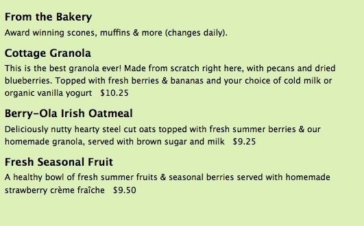
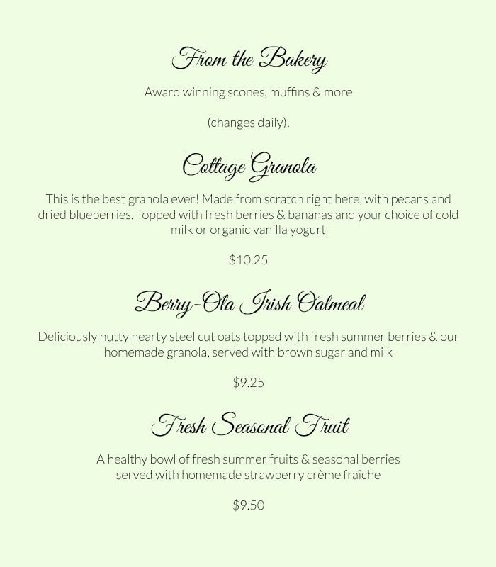
Here’s their current menu (a screenshot from their website), and a redesign example of what could be done to make their food seem even more special.
Current Menu (screenshot)
My Redesign (quick example)
Another thing that could be done to give the feeling of an exquisite food experience is that we could reword the menu somewhat. Long descriptions with big words slow down a reader and imply that more effort and skill is needed by the chef to prepare that particular dish.
And, if for some reason the McKay Cottage Restaurant wanted to raise their prices, they might employ a neuro-strategy employed by some restaurant owners where they would eliminate the “$” sign from their menus and list their prices as simple “12” or “14.00”.
A study published in the spring by Dr. Kimes and other researchers at Cornell found that when the prices were given with dollar signs, customers — the research subjects dined at St. Andrew’s Cafe at the Culinary Institute of America in Hyde Park, N.Y. — spent less than when no dollar signs appeared. The study, published in the Cornell Hospitality Report, also found that customers spent significantly more when the price was listed in numerals without dollar signs, as in “14.00” or “14,” than when it included the word “dollar,” as in “Fourteen dollars.” Apparently even the word “dollar” can trigger what is known as “the pain of paying.”
Web design isn’t just about throwing some text and photos into html. For your next website project, take some time to think about what your typography is telling your visitor. There are many things in design that often speak much louder than words.
Source: NeuroMarketing and University of Michigan


