On May 28, 2015, the Brave Software company was founded by CEO Brendan Eich and CTO Brian Bondy. They were on a mission to improve the web by giving people a safer, faster and better browsing experience. They are also interested in growing support for content creators through what they call a new attention-based ecosystem of rewards.
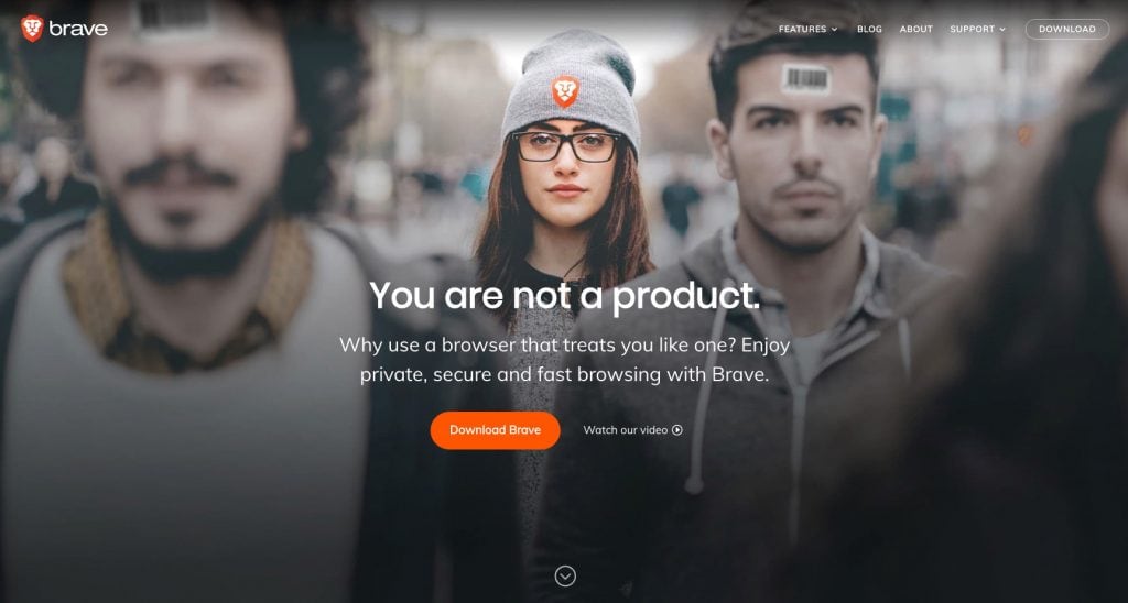
Below is a screen capture of the Brave Software homepage. I believe that this is an example of a homepage done right.

What’s right about the homepage? First, it’s clean and simple. The graphic absolutely goes with the message. The message is to the point and it takes a stand.
When they state, “you are not a product” they’re connecting with the feelings and values of their target audience.
If you believe that you are not a product and you’re frustrated by companies that treat you like one, that statement will resonate with you. Will it resonate with everyone? Absolutely not. But that’s the point. The message is polarizing and it attracts the right people.
This is what so many companies seem to be afraid to do. To take a stand. To be polarizing. You can’t be loved by everyone while doing something that matters and that makes a difference. To take a stand means some people will like what you stand for and others will not. And that’s perfectly okay. Why? Because not everyone is your ideal customer or your client.
The next line on Brave’s homepage reads, “why use a browser that treats you like one?”. They’re clearly defining what’s going to change if you choose their browser. They’re offering a solution to being treated like a product.
Then, in their last line, they highlight what you stand to gain. Privacy, security, and faster browsing experience.
So, in conclusion, this homepage is clear, polarizing, offers a solution to a problem and the graphic absolutely supports the message. I love how they placed the brave logo on the hat of the woman in the middle. Did you notice the image focuses on her? The rest of the scene is blurred. What’s the message that they’re sending?
If your homepage had these elements, you would be much more likely to attract the right clients or customers that you would love doing business with.
Photo credit: See, standing out is fun! Thanks for the photo, Jade Masri.
